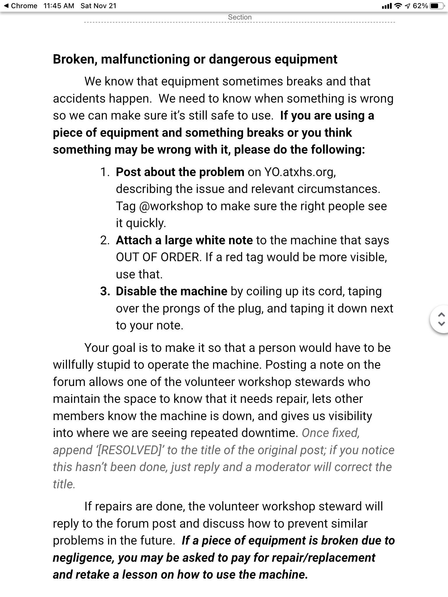
Can we get the process in member handbook aligned with what facilities team wants? Right now it says to post in the yo (should say “in the appropriate space team”) and to tag at-workshop, which will alert both the workshop team and other members that there’s an issue. Does mean logging in to YO, but it’s very straightforward. In Joe’s recent reply the link just went to the main site, and another member just reported the same or a different dead end.
Having the problem report, discussion, post-mortem and resolved report public and all together for future reference in our primary communication channel is compelling. if it needs outside syndication, we could instead make a red tag category and subscribe an email address to or something it.
Hey Flip et al
Thanks for your post here about damaged equipment and reporting same. I’d like to note a simple addition to the website and relate it to the section related to commutation with others.
There are a few (I think) commonly used web resources at atxhs.org. I don’t know if the way the website was designed was by one person or a committee. I certainly don’t want to throw any shade on the efforts of volunteers. We all appreciate their efforts.
IF this is the main portal for members (easily typed into a browser) then perhaps some minor changes could be considered. Access to reserve time on the space and communication with others I think ought to be included. I believe membership is necessary to access / use those resources.
The design of the smart phone version of the main website atxhs.org needs some work. The menu choices do not present sub menus, at least on my iPhone. For instance I can “join” but there’s no link to “log in” to atxhs.z2systems.com. I understand the reasoning to work with separate service providers (scheduling and mail and billing etc.) but I think the system could better serve the community if the user interface were easier to navigate, especially on a mobile phone.
We can’t get to satisfaction through complaint. So I’d be willing to discuss changes with people in charge. Again no shade. let’s just work to make things better and more user friendly.
They are there for me on iOS, but have to click the “Members” section which may be off the bottom of the screen. I’ve suggested the links be renamed from Neon, Skedda, etc to Manage Membership, Book Time, etc and that we add links for the handbook, code of conduct, and red tag policy. The menu implementation of the template we’re using is weak and probably out of our control, but if a section of the page just had these as plain links that would be useable on any platform.
These are good suggestions and thanks for expressing your appreciation along with the ideas.
Yep, for sure. We definitely have some work to do in making our online resources more usable on mobile devices, and I think it makes sense to start with your front-page suggestions.
It MAY be useful and more efficient to meet at the HS to share phones so we can actually SEE what others are seeing. Some web platforms are kind of lame at this.
I have a site on Squarespace that works well for me but that is not to say it is suitable for HS. Just that different templates offer strengths and weaknesses. Phone, pad, desktop viewers.
Flip, i think even having just simple links to serve members needs “above the fold” would be helpful. Icons even to save space on the screen.